ShopDreamUp AI ArtDreamUp
Deviation Actions


Suggested Deviants


Suggested Collections


You Might Like…


![Yet another day in clan - YCH [COMPLETED]](https://images-wixmp-ed30a86b8c4ca887773594c2.wixmp.com/f/97c86438-74c6-48c0-8d13-84c4e69ace8d/d9xli08-e43213af-bb9f-48a5-8845-f089918625b5.png/v1/crop/w_184,h_184,x_23,y_0,scl_0.184,q_70,strp/yet_another_day_in_clan___ych__completed__by_salusia_d9xli08-92s-2x.jpg?token=eyJ0eXAiOiJKV1QiLCJhbGciOiJIUzI1NiJ9.eyJzdWIiOiJ1cm46YXBwOjdlMGQxODg5ODIyNjQzNzNhNWYwZDQxNWVhMGQyNmUwIiwiaXNzIjoidXJuOmFwcDo3ZTBkMTg4OTgyMjY0MzczYTVmMGQ0MTVlYTBkMjZlMCIsIm9iaiI6W1t7ImhlaWdodCI6Ijw9NjgzIiwicGF0aCI6IlwvZlwvOTdjODY0MzgtNzRjNi00OGMwLThkMTMtODRjNGU2OWFjZThkXC9kOXhsaTA4LWU0MzIxM2FmLWJiOWYtNDhhNS04ODQ1LWYwODk5MTg2MjViNS5wbmciLCJ3aWR0aCI6Ijw9MTAyNCJ9XV0sImF1ZCI6WyJ1cm46c2VydmljZTppbWFnZS5vcGVyYXRpb25zIl19.zNEHSx117Zvu1pYIZUS0uqsuxDmsU8Beh34Khj-8JGI)
![Yet another day in clan - YCH [COMPLETED]](https://images-wixmp-ed30a86b8c4ca887773594c2.wixmp.com/f/97c86438-74c6-48c0-8d13-84c4e69ace8d/d9xli08-e43213af-bb9f-48a5-8845-f089918625b5.png/v1/crop/w_92,h_92,x_12,y_0,scl_0.092,q_70,strp/yet_another_day_in_clan___ych__completed__by_salusia_d9xli08-92s.jpg?token=eyJ0eXAiOiJKV1QiLCJhbGciOiJIUzI1NiJ9.eyJzdWIiOiJ1cm46YXBwOjdlMGQxODg5ODIyNjQzNzNhNWYwZDQxNWVhMGQyNmUwIiwiaXNzIjoidXJuOmFwcDo3ZTBkMTg4OTgyMjY0MzczYTVmMGQ0MTVlYTBkMjZlMCIsIm9iaiI6W1t7ImhlaWdodCI6Ijw9NjgzIiwicGF0aCI6IlwvZlwvOTdjODY0MzgtNzRjNi00OGMwLThkMTMtODRjNGU2OWFjZThkXC9kOXhsaTA4LWU0MzIxM2FmLWJiOWYtNDhhNS04ODQ1LWYwODk5MTg2MjViNS5wbmciLCJ3aWR0aCI6Ijw9MTAyNCJ9XV0sImF1ZCI6WyJ1cm46c2VydmljZTppbWFnZS5vcGVyYXRpb25zIl19.zNEHSx117Zvu1pYIZUS0uqsuxDmsU8Beh34Khj-8JGI)


Featured in Groups


Description

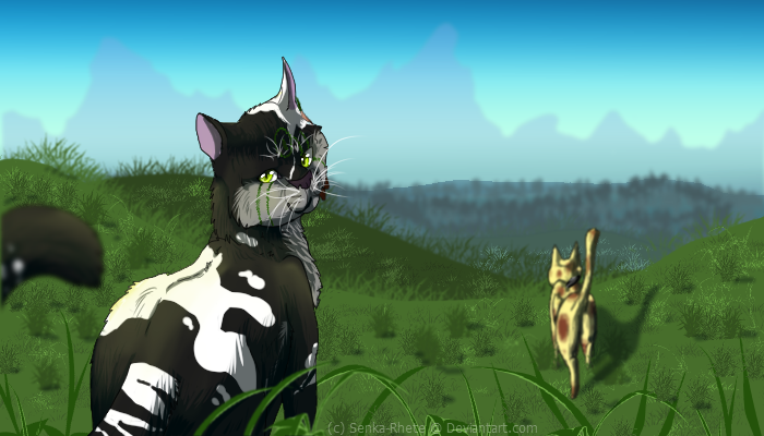
Won't you join us?
*accepting applications*
The non-text/non boarder banner I made to promote the opening of tCoS.
With text/boarder

I am really pleased with this picture. Again I was practicing on my shading and backgrounds. I tried a different angle as well for Unole, which was somewhat of a pain. So any pointers on that would be greatly appreciated :3
Art + Characters (C) 
Image size
700x400px 306.16 KB
© 2014 - 2024 xSenkai
Comments2
Join the community to add your comment. Already a deviant? Log In
I love writing critiques, so you're in luck.
I like to star out with the top 3 pros/cons then describe the four categories.
Pro's
- Body Shading. I can tell there is a definite light source, congrats.
- The Perspective. There are a ton of elements to his, from the blurred tail to the grass.
- Anatomy. Your feline anatomy is semi-realistic, and they look like real cats. That's a hard thing to do.
Cons's
- Background. I hate to say it, but the patches of grass don't quite look like the rest of the piece.
- Sky Gradient. Oh man, I can tell that it's the sky and the colors are good, but something about it just looks different from the rest of the piece?
- Color Choice for the last Hill. I'm being specific for this part, as well the gradual blue just looks off. Perhaps a darker green blue like the hill in front of it? Maybe just combine the two?
Vision; 3.5/5. Like you said, you were trying with perspective and and I can see that. You could still use some work on it though.
Originality; 4.5/5. I love the whole piece and the idea of it being like a propaganda poster for war, advertisement ect.
Technique; 4/5. You have very good skill and used it in this piece. If not for my nit-picking I'd give you a 5/5.
Impact; 4/5. Overall is a good piece that made me smile. The quality is very nice but, like I said in the cons there are little things that could use work.